A question worth solving.
How do you give an emerging premium haircare concept a cohesive digital identity while keeping a product-heavy website intuitive on a phone?
 Independent Digital Studios
An editorial curl-care storefront, designed around natural textures, warm neutrals and an effortless browsing experience.
Explore the actual website ↗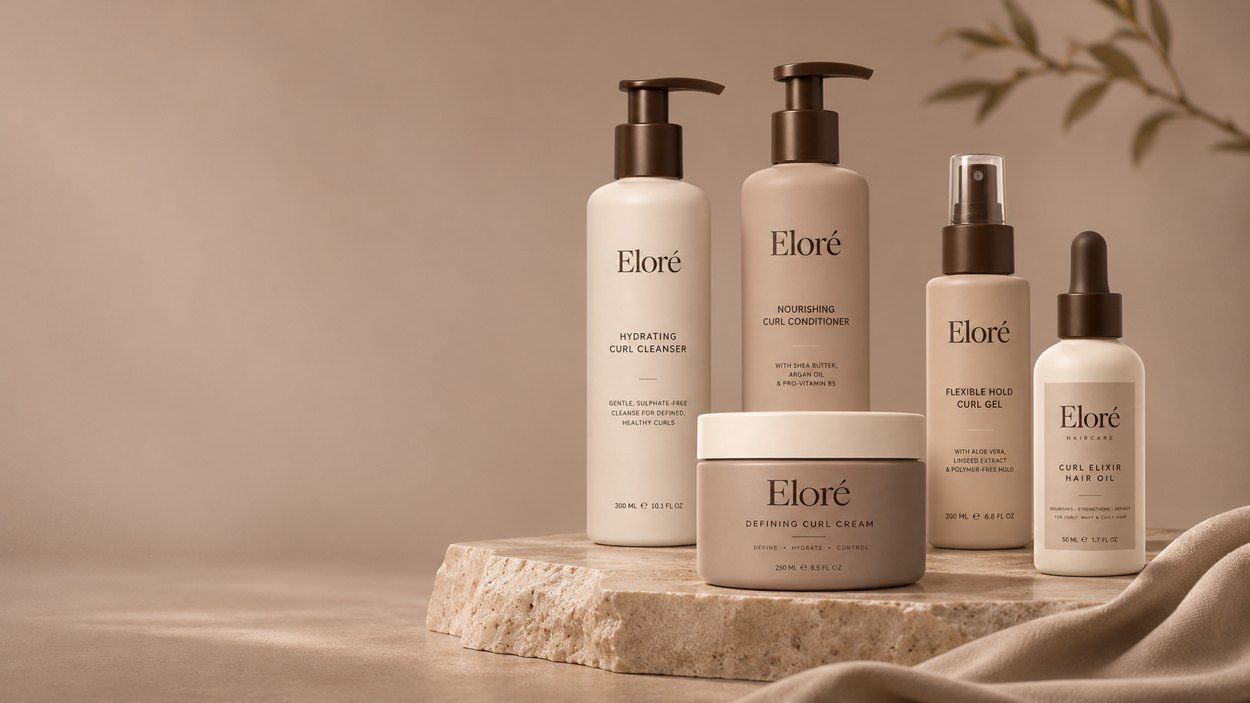
Each portfolio study begins with an imagined business challenge and a working design response. No customer results or real-world commissions are implied.
How do you give an emerging premium haircare concept a cohesive digital identity while keeping a product-heavy website intuitive on a phone?
Warm ivory tones, restrained type and detailed product imagery establish character without distracting from browsing. The visual system is carried through the page hierarchy, product interactions and responsive layouts.
A working front-end storefront concept that demonstrates product discovery, navigation and responsive merchandising. Checkout and real order processing are not part of this demo.
A closer look at the functional elements developed for this demonstration.
Coordinated product presentation with imagery, descriptions and clear navigation.
Layouts and visual hierarchy designed for smaller screens as well as desktop.
Shopping-oriented interactions and page elements presented as a concept, not a live checkout.
Explore both responsive previews below. Scroll inside either frame, or open the complete website in a separate tab for the best experience.
A true mobile-width preview. Scroll inside the phone to explore the page.
Explore full mobile experience ↗A neutral palette and generous negative space leave the product presentation room to breathe.
Content, imagery and navigational cues help visitors move from discovery to product detail.
The interface adapts the visual experience rather than simply shrinking the desktop layout.
This is a self-initiated concept. Photography and project narratives are illustrative; no client outcomes or real business performance are claimed.